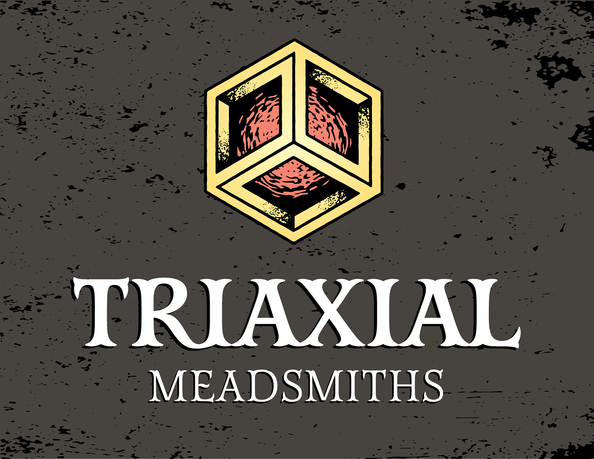
I wanted to use a typeface that had decorative serifs, while still being very legible. I finally settled on Mr. Darcy purchased for use on Creative Market after some extensive searching. I created a sort of ligature with the R and I in Triaxial for a little bit more of an interesting shape between the letters.
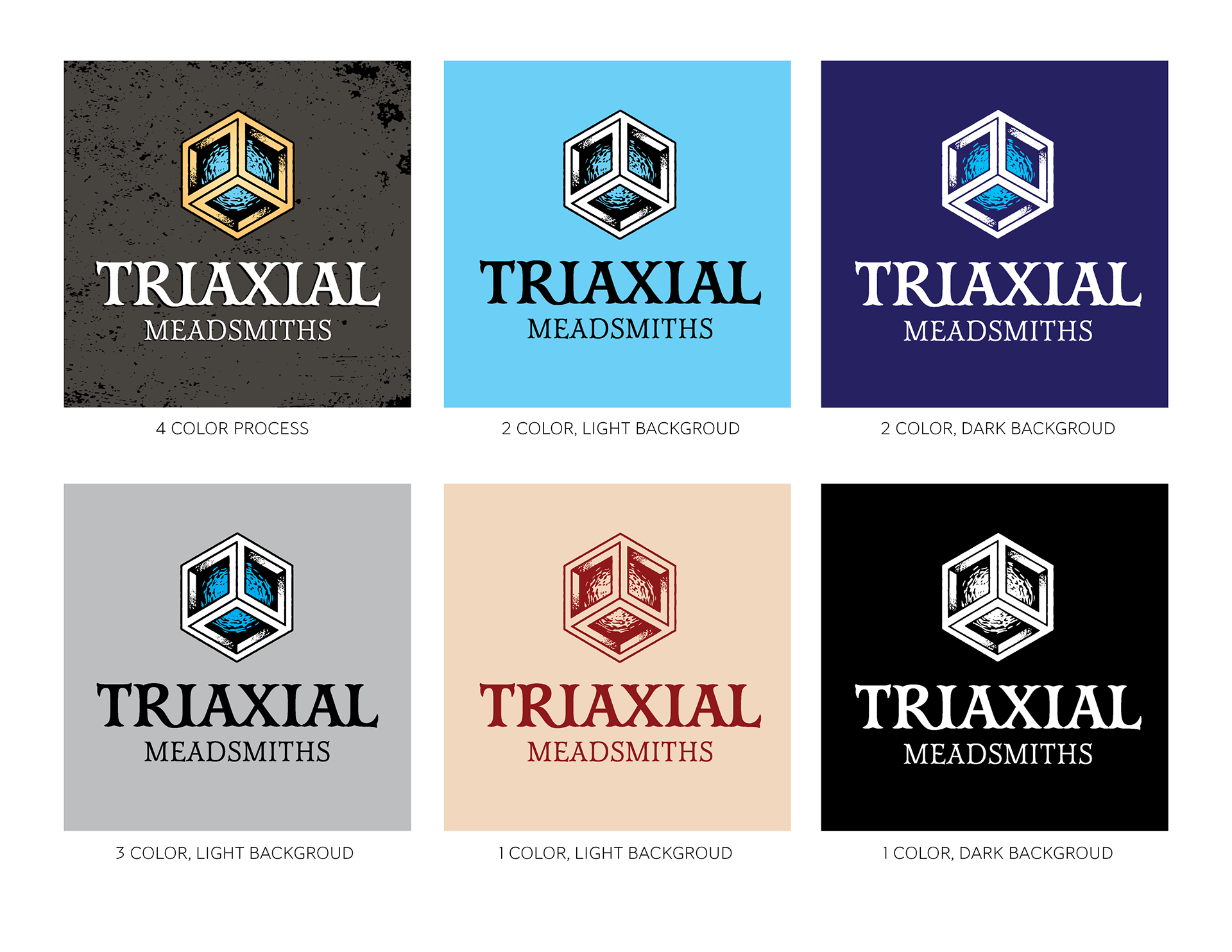
I wanted to make sure that there where versions of the logo for different applications, such as 1 and 2 color artwork for screen printing. Light on dark applications required a reverse design.