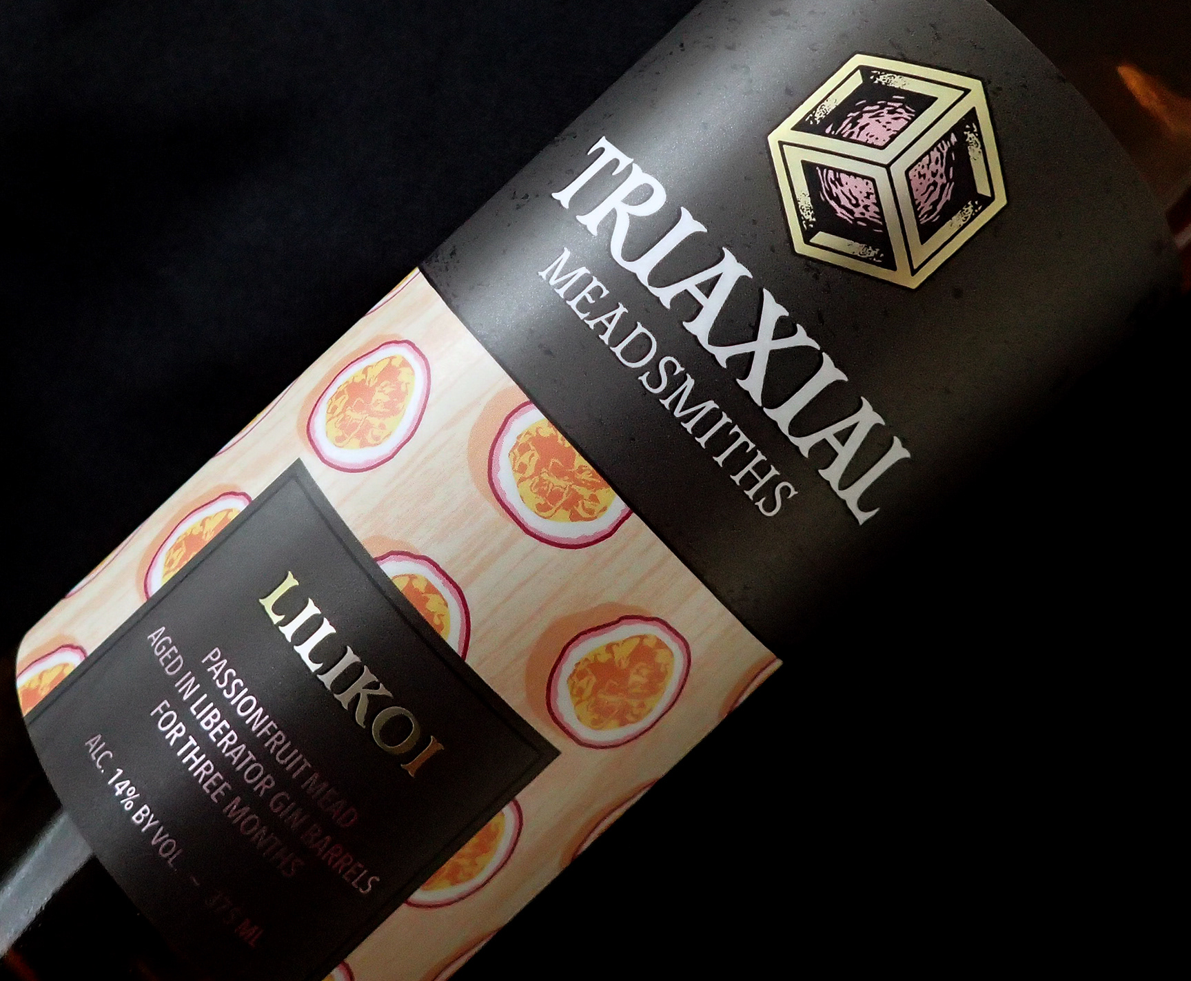
I decided to utilize metallized BOPP label stock to allow an opportunity to add some areas of shine to the artwork. This helped with obtaining a higher-end feel, while keeping final costs down.
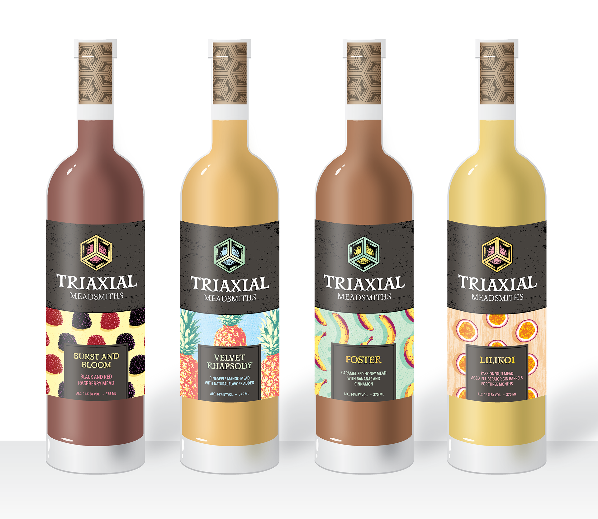
These are concept mock ups that I created for label and cork designs. I use these for presentations to help visualize the end result before printing. These were drawn in Illustartor.

I create illustrations for the lower panel of the label to help advertise the ingredients used in each product release.
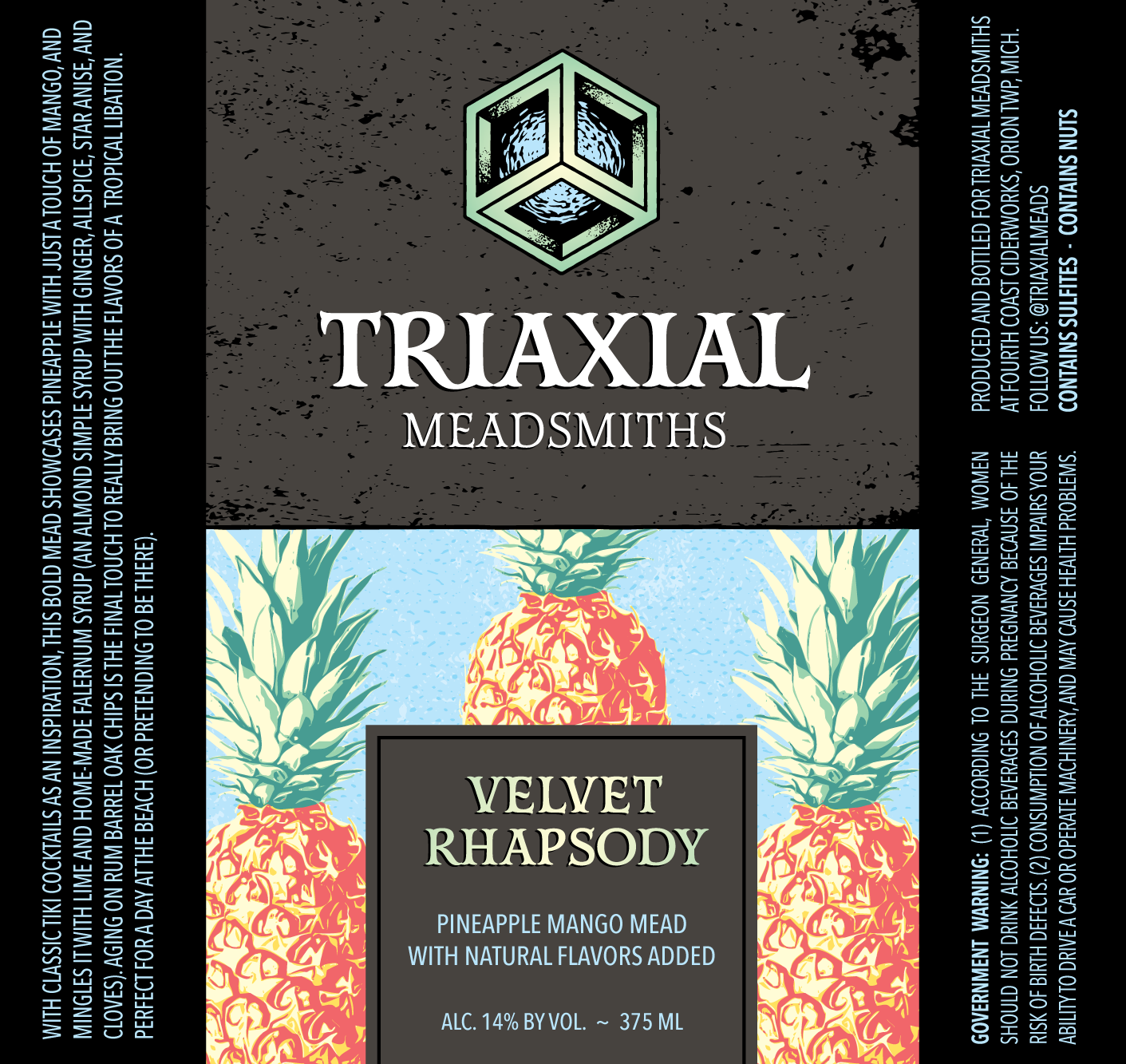

The cube in the logo is coordinated with the color palette of the label artwork.

